Start with your audience at the forefront
Ask yourself what story you want your data to tell your audience. How does the information benefit the reader? And most importantly, how easy is the information to understand at first glance?
The answers to these questions will help you to determine the best way to visualise that data. For example, whilst graphs and charts are a great way to compare data or show change over time, infographics are much better for giving an overview of a more data-heavy topic. In some cases, a simple explainer animation may be the very best way of telling your data’s story. For more guidance on how best to visualise your data, check out our recent blog here.
Ask for maximum impact, not minimum
requirements
While some elements of accessible design can be measured by a ‘pass’ or ‘fail’ – like colour contrast ratios – there are many other elements that can’t, and shouldn’t, be measured that way. WCAG accessibility guidelines aren’t designed as a checklist that can be ticked off so you can walk away thinking the work has been done. Our standard for creating accessible content should be by asking ourselves ‘how can we make this as inclusive and enjoyable as we possibly can for everyone in our audience?’
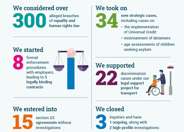
This was the exact mindset we adopted when creating the Impact Report for the Equality and Human Rights Commission (EHRC). We created a suite of on brand illustrations to accompany each story and bring the data to life, as you can see in the below eye-catching infographic:

Best practices
Once you’ve considered the experience through your audience’s eyes and decided on the best format for your data visualisation, it’s time to consider best practice for making your content accessible. Here is where you need to take into account the varying abilities among your audience and compatibility with assistive technologies.
Here’s a list of some important considerations to take into account:
- Text: Use clear titles, summaries and data labels to help your data tell a clear story, rather than just assuming your graphic will immediately make sense to everyone. Your title should tell your audience what information to look out for. Keep labels and annotations short and simple, and avoid using very small font sizes that could be difficult to read.
- Alt text: Include descriptive alt-text for any images or graphical elements that will help those using screen readers get a picture of what’s being represented. But avoid using alt text for any decorative elements that don’t add any value as it could detract from the message you’re trying to get across.
- Colour: Use a colour contrast checker to make sure there’s enough contrast between your foreground and background colours. And make sure colour isn’t the only way of conveying information. For example, use data labels with a connecting line rather than a colour-coded key as this won’t alienate any members of your audience who are visually impaired or colourblind.
- White space: This is really helpful for making sure that your audience doesn’t have to distinguish between colours. Adding white space between segments of a pie chart or using different patterns in a line graph will enable your audience to identify between different data sets, making it much easier to process the data that’s being shown.
- Avoid interactive elements: Don’t require your audience to do things like hover over elements of your graph to see further information as this isn’t compatible with assistive tech. Showing the full information at all times provides a much more inclusive experience for your audience.
Helping our clients communicate their data in an accessible way one of the things we do best at Eleven. If you’re looking for support with making your data visualisations inclusive, get in touch with us and we’ll be more than happy to help.
Originally published:
July 28, 2022
Updated:
December 20, 2023


