A report showcasing the EHRC's positive impact on human rights.
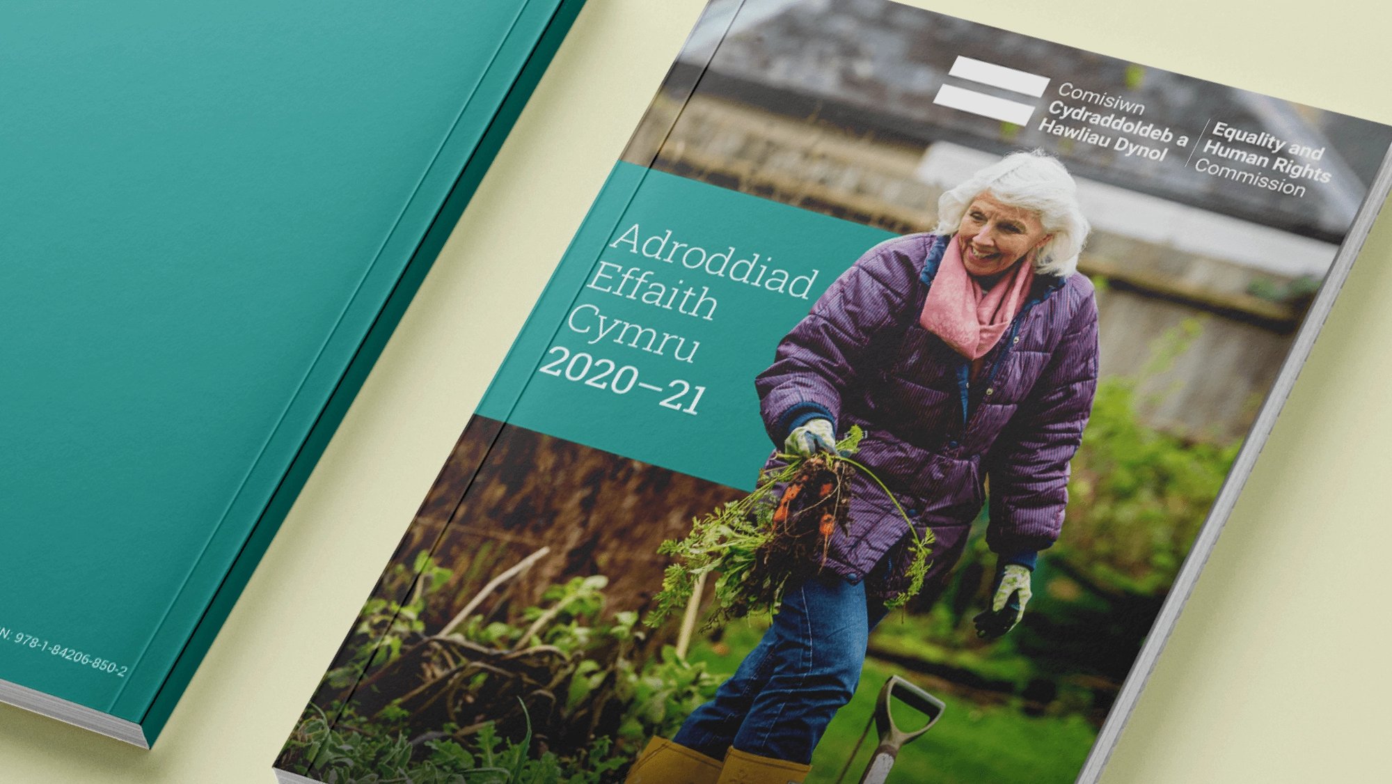
The Equality and Human Rights Commission (EHRC) publishes its annual impact report with one purpose – to showcase the impact the Commission has had on promoting and upholding equality and human rights ideals and laws across England, Scotland and Wales.
The EHRC asked us to design the report so that it was highly engaging, clearly on brand and accessible to WCAG 2.1 standards.
A report showcasing the EHRC's positive impact on human rights.
Project summary
- Graphic design
Approach
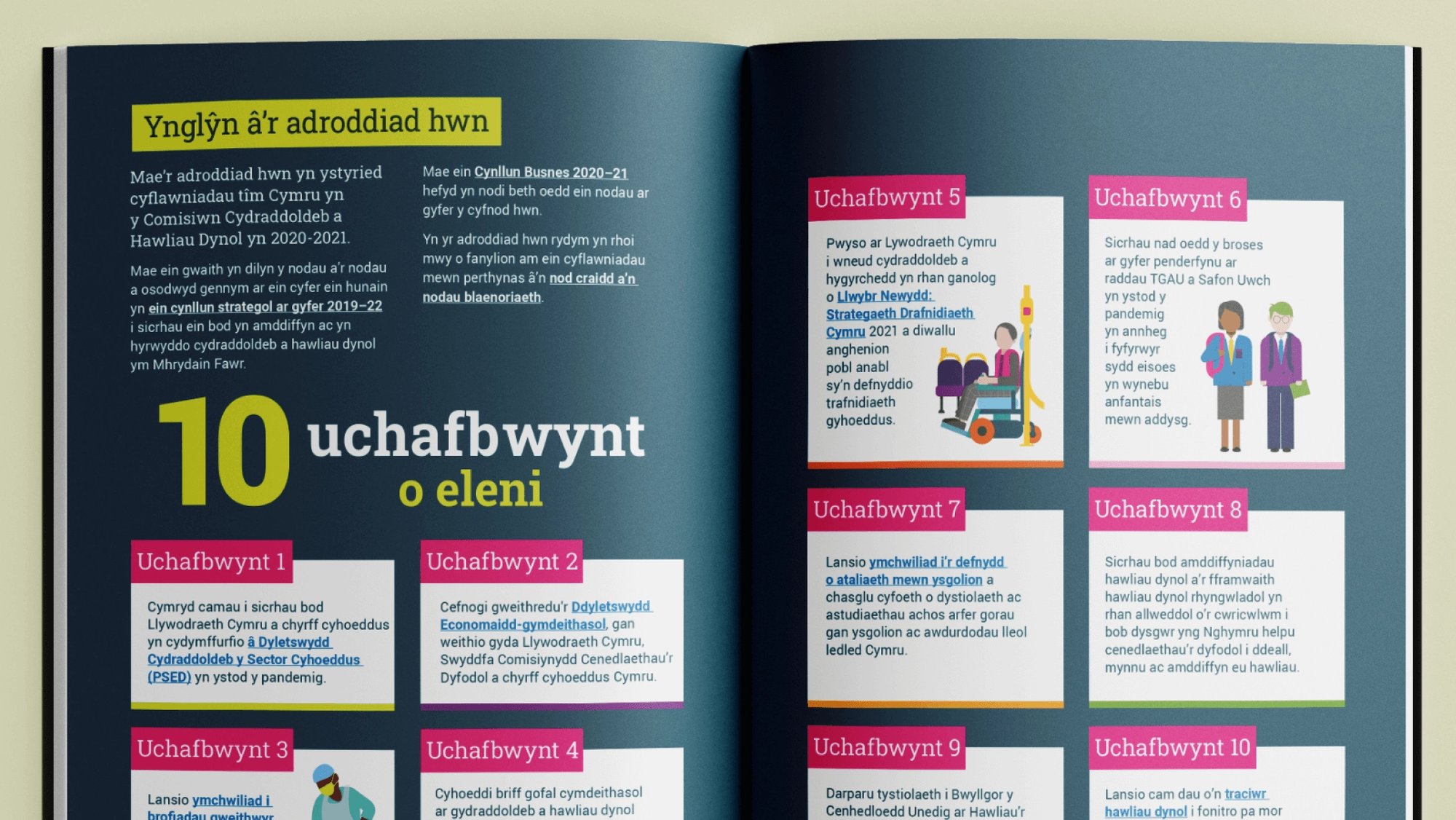
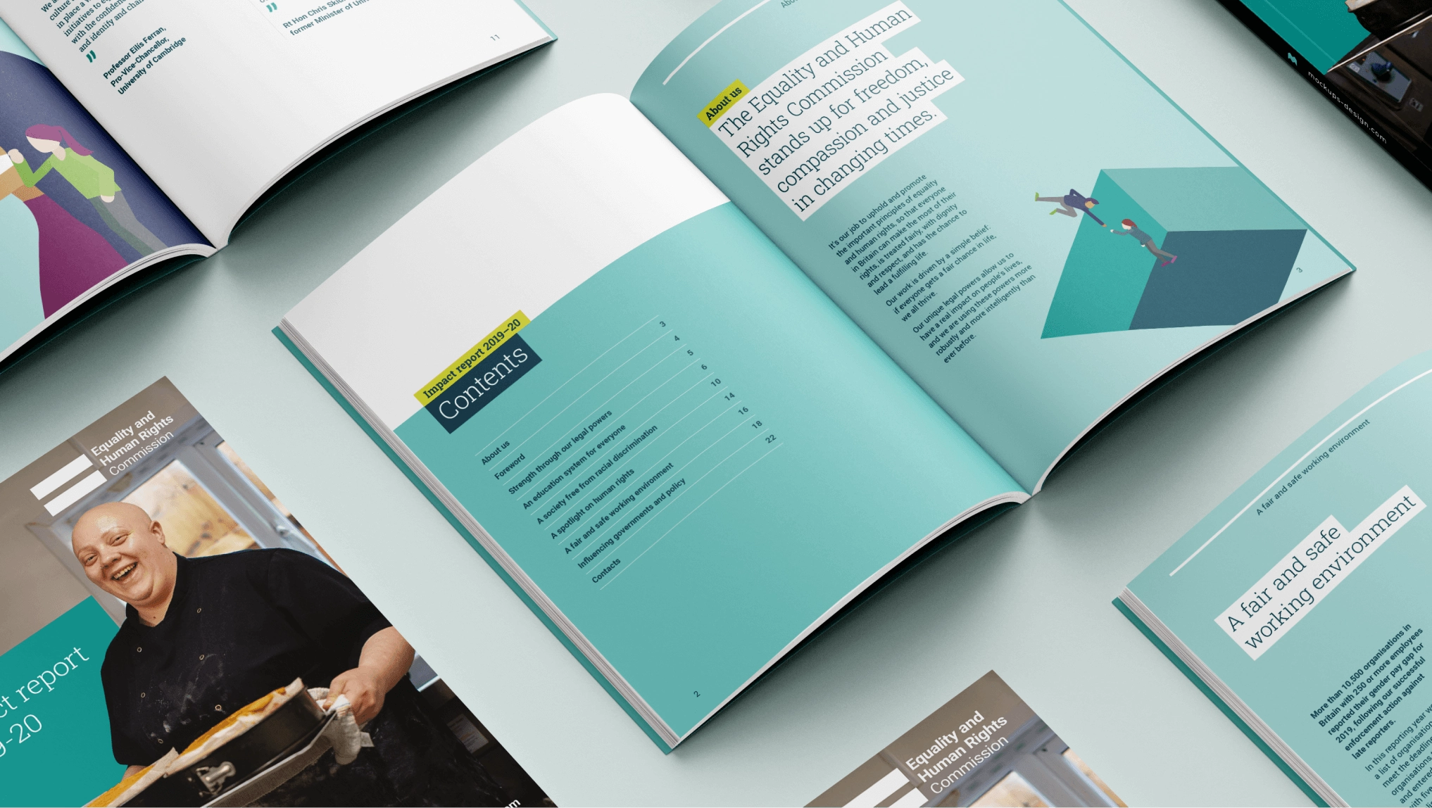
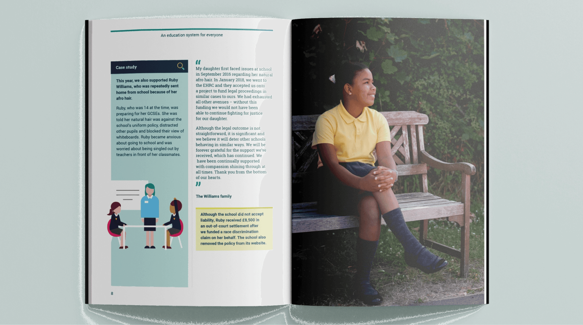
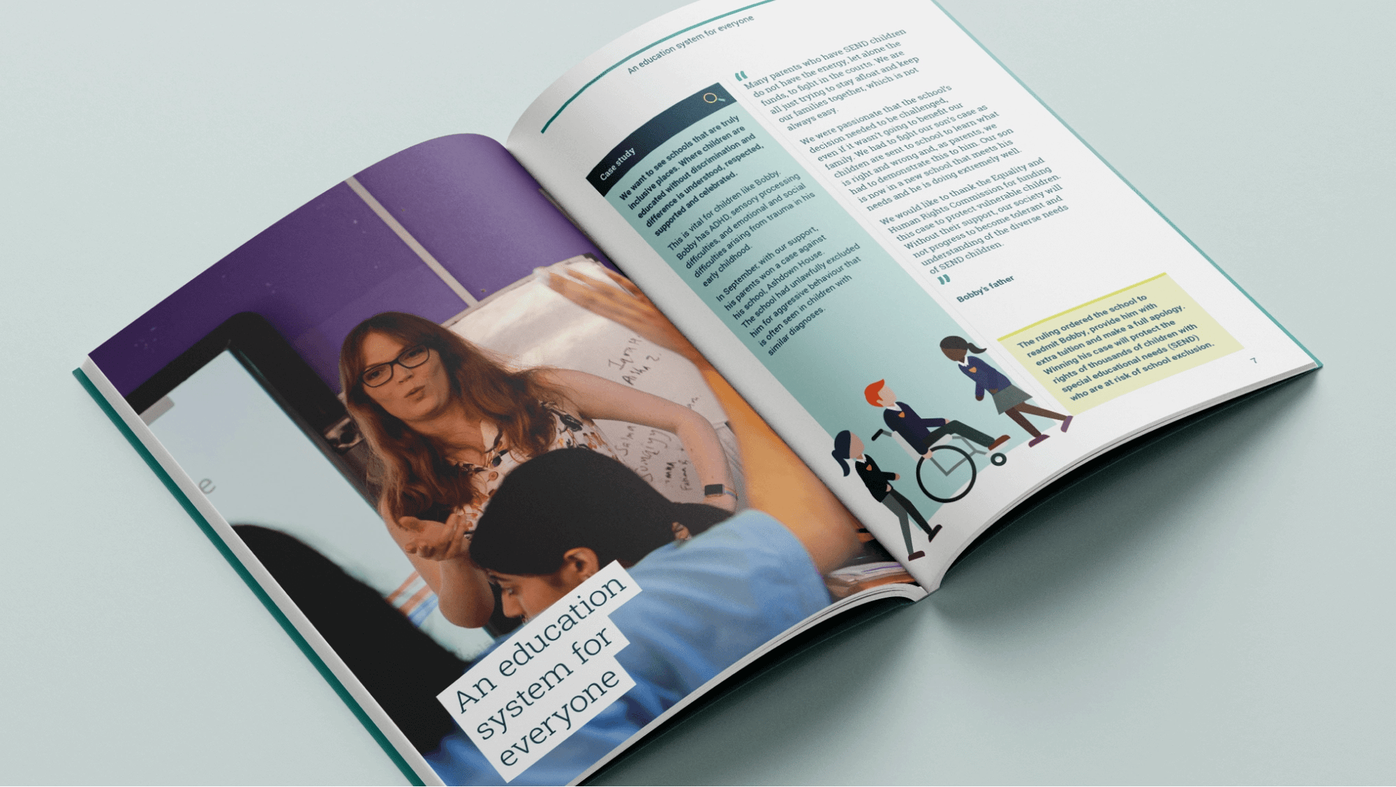
While the work the EHRC does is positive, the report touched on negative situations. This meant we needed to focus on positive social impact when creating graphics and sourcing imagery. We used diverse photography and created well-rounded iconography to help illustrate the points of each section. We also developed a suite of on-brand illustrations to accompany each story – bringing the report to life.
We produced accessible digital and print versions of the report, compliant with WCAG 2.1 AA standards. Visually, this meant following best practice when it came to font size, text placement, colour contrasts and white space. And from a technical perspective, this involved things like including clickable links for easy navigation and adding audio descriptions to all images, icons and links to make them compatible with screen readers.


Impact
The ERHC was really pleased with our creative work, with the look and feel signed off first time.
Providing this report in accessible digital and print formats meant that the widest possible audience of stakeholders could access and consume the report in a way that suited them.
"The design quality was excellent and delivered everything we’d ask for – a unique look and feel and creative bespoke graphics – while adhering to our brand guidelines and accessibility requirements. We received a lot of positive feedback from colleagues that they thought the layout was bold, easy to read and a step up from previous years’ reports."
Content Manager
Equality and Human Rights Commission
